QR Code Design Ideas: Creative Examples for 2026
QR code design ideas that actually scan: color palettes, logo embedding limits, module shapes, frame CTAs, and real industry examples for 2026.

This article was written by the QR Nova team. We build QR code software, which may inform our perspective.
Most articles about QR code design ideas show you pretty examples and stop there. They skip the part where a rainbow gradient code fails to scan on roughly 30% of budget Android cameras (per QR code scanning tests documented in the ISO/IEC 18004 conformance literature), where logos placed over finder patterns—the three corner squares—destroy scan reliability regardless of error correction level, and where "rounded modules" look great while quietly killing scannability. A custom QR code design only works when visual creativity operates within the technical constraints of ISO/IEC 18004. Most design guides pretend those constraints do not exist. This guide covers every practical QR code design idea—from color palettes and logo placement to module shapes and frame CTAs—with the exact rules that keep them scannable. No account required to try any of these at QR Nova.
TL;DR
- Minimum contrast ratio: 4.5:1 between modules and background. Below this, scan failure rates climb sharply on budget Android cameras.
- Logo size limit: 30% of total QR area maximum. Use Error Correction Level H whenever a logo is present.
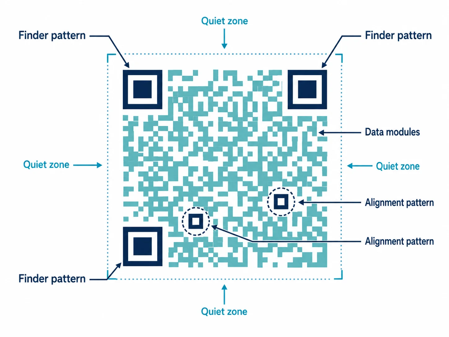
- Never touch the finder patterns (the three corner squares) — custom shapes there kill scannability regardless of how good the rest looks.
- A well-designed branded QR code drives approximately 30% more scans than a plain black-and-white code of identical content.
What Makes a QR Code Design Actually Good
Design your branded QR code — free
Get startedA good QR code design is not the prettiest code. It is the most scannable code that is also brand-consistent. Those two goals pull against each other, and every design decision is a trade-off between them.
The ISO/IEC 18004 standard defines QR code structure: three finder patterns in the corners, alignment patterns for larger codes, timing patterns (the alternating row/column), and data modules filling the rest. Creative customization can only touch the data modules and the outer frame. The structural elements are non-negotiable.
Three technical rules govern the rest:
- Contrast ratio: Foreground modules must be at least 4.5:1 darker than the background. A 7:1 ratio is recommended for print and outdoor use where lighting is unpredictable.
- Quiet zone: Four module widths of clear space on all sides. Designers who bleed a QR code to the edge of a business card without this margin produce a code that fails on most phone cameras.
- Error correction level: Level H (High) allows up to 30% of modules to be obscured and still recover the data. This is the required setting whenever a logo, icon, or watermark covers any part of the code.
QR Code Design Ideas: Color Palettes That Actually Scan
Color is the most visible design lever for QR codes and the most commonly misused one. Dark modules on a light background, with enough contrast that a camera sensor can distinguish the two under varied lighting. That means a 4.5:1 ratio—the same threshold used in web accessibility (WCAG AA). These color QR code design ideas work precisely because they respect that floor.
High-Contrast Brand Color Approaches
Monochromatic brand color: Replace black with your primary brand color, keeping the background white. Navy blue (#1e3a5f) on white gives a 13.2:1 ratio—well above the minimum. Forest green, dark burgundy, and charcoal work equally well. This is the safest creative option because it changes only the hue, not the contrast relationship.
Brand background with dark modules: Use a light brand color as the background and dark modules on top. Canary yellow backgrounds with black modules are common in retail because yellow grabs attention while maintaining contrast. Pale blue backgrounds with dark navy modules work for tech brands.
Two-tone brand palette: Use your primary dark color for modules and a secondary light color as the background. Cadbury uses deep purple modules on cream—a 6.8:1 ratio that matches their packaging exactly. Straightforward, and it works.
What to Avoid
Gradient modules are the most common cause of custom QR scan failures. A gradient that fades from dark blue to light blue to near-white drops module contrast below 4.5:1 in the lighter regions—and scanners read the entire code, not just the darker parts. Want a gradient? Put it on the outer frame or background. Never on the modules.
Inverted QR codes (white modules on dark background) fail on roughly 15% of devices—particularly older Android models with less sophisticated camera software. Avoid them for mass-distribution print materials. For digital-only use, they are acceptable.
Logo Embedding QR Code Design Ideas: Size Limits and Placement
A centered logo inside a QR code is the most recognizable form of QR code branding—and one of the most requested QR code design ideas for businesses. Done correctly, scan reliability stays the same. Done incorrectly, you get a code that looks great in a mockup and fails at the point of sale.
The 30% Rule
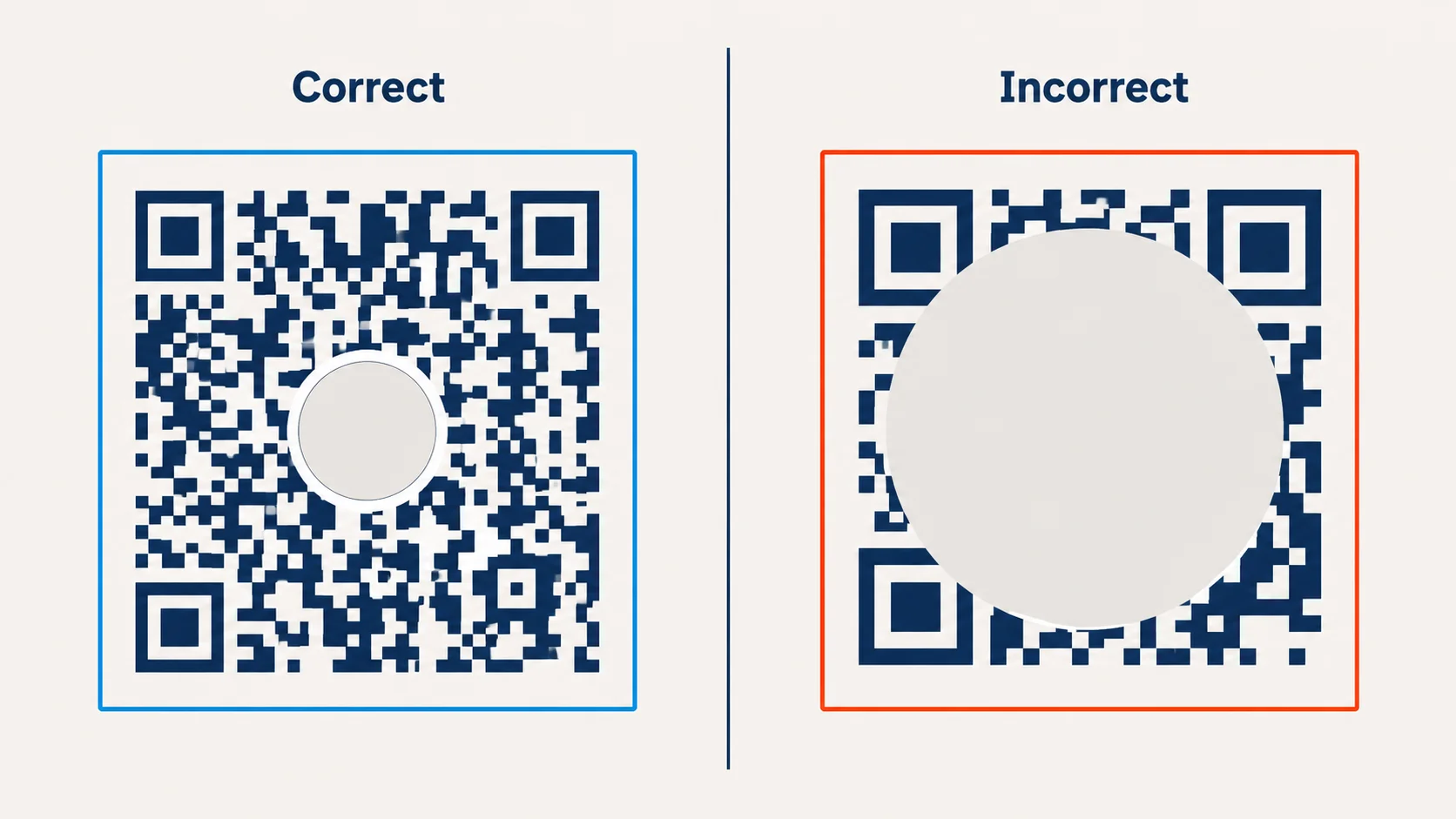
Keep your logo under 30% of the total QR code area. That is the ceiling, not a target. In practice, 20-25% coverage is the sweet spot—visible enough to brand, small enough to stay reliable. Quick math: a 500px × 500px code (250,000 px²) means your logo stays under 75,000 px², roughly 270px × 270px.
Error Correction Level H recovers up to 30% of obscured data. That is why 30% is the ceiling. A logo at exactly 30% uses every bit of your error correction budget. One scratch on a printed code and it tips into failure.
Placement Rules
Always center the logo. The center of a QR code contains redundant data, by design. The three finder patterns in the corners contain none. Placing a logo over a finder pattern destroys scannability regardless of error correction level, because finder patterns cannot be recovered—they are structural, not data.
Add 8-12 pixels of white padding around the logo before placing it on the code. This separates the logo from the surrounding modules and keeps the scanner from reading logo pixels as data modules.
Logo Simplification
Use a simplified version of your logo at this size. A full wordmark with fine typography will not render legibly inside a 270px circle. Use your icon, monogram, or logomark. The goal is brand recognition at a glance—people see the logo before they scan, and that alone is enough to signal trust.
Module Shape QR Code Design Ideas
Standard QR code modules are square. Most custom QR generators let you change module shape: rounded corners, full circles (dot patterns), diamond shapes, and more. The visual differentiation is real—so are the scannability trade-offs. Know what you are getting into before you choose.
Rounded Modules
Rounded corners reduce the sharp edges that camera sensors use to distinguish module boundaries. The more rounded the corners, the more white space appears between modules—and the harder it becomes for budget cameras to read the code. Mildly rounded (corner radius around 20-30% of module width) adds visual softness with minimal scan impact. Fully rounded circles (dot patterns) shrink contrast area enough to cause failures on cheaper cameras. Fine for high-end print scanned up close. Not for outdoor signage or packaging on products that move.
Custom Finder Patterns
Many generators let you customize finder pattern shapes—the three large squares in the corners. Rounded finders, dots, custom shapes: all of these change the QR code appearance dramatically. The risk is straightforward: if your custom finder pattern strays too far from the standard square-within-square structure, older scanner firmware may not recognize it. Modern phones handle most variations. Older scanners, used in environments with aging hardware or older demographics, may not.
Eye and Module Style Combinations
The safest combination for brand QR codes: square or mildly rounded outer finder border, rounded inner finder dot, square or lightly rounded data modules. Modern look, reliable scan. Avoid all-circle module patterns combined with custom finder shapes—that stacks two sources of scan risk on top of each other.
Frame Design and CTA Text
The frame around a QR code is underused. A frame with call-to-action text changes scan behavior: people know what they get before scanning, which increases intent and drives conversion. An unframed, unlabeled QR code asks users to trust an unknown destination. Most don't. A framed code with context removes that hesitation.
CTA Text That Works
Effective QR code frame CTAs are action-oriented and specific about the destination or benefit:
- "Scan to see the menu" — restaurants and cafes
- "Scan for your discount" — retail promotions
- "Scan to check in" — events and conferences
- "Scan to connect on LinkedIn" — business cards and networking
- "Scan to watch the demo" — product packaging and trade shows
- "Scan for exclusive content" — magazines, packaging inserts
Keep the CTA under six words. Anything longer gets ignored on small stickers and undercuts the visual weight of the code itself. Describe the action (scan) and the immediate outcome (menu, discount, demo). Not the brand benefit. Not a tagline.
Frame Design Consistency
Match the frame to your brand system. Rounded rectangle frames work for brands with soft, rounded logo marks. Hard-edge geometric frames suit angular identity systems. Use one of your brand palette colors for the frame—it is a brand touchpoint, not a generic border.
QR Code Design Ideas by Industry Sector
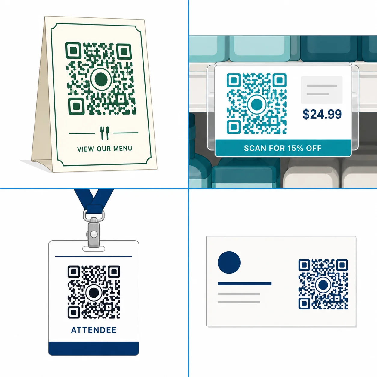
Restaurant Menu QR Code Design Ideas
The most common use case globally since 2020. Best practice: dark green or navy modules on white or cream background, restaurant logo centered at 20% of code area, table-stand frame with "Scan to see today's menu." Minimum print size: 4 cm × 4 cm on table cards—scanning from a seated position is 30-50 cm and ambient lighting is often low. Link to a mobile-optimized menu page, not a PDF. PDFs fail on slow connections and deliver terrible mobile UX. A dynamic QR code lets you update the menu URL each season without reprinting anything.
Retail Promotional QR Code Design Ideas
Retail QR codes live on shelf labels, receipts, and window stickers—all high-ambient-light, short-scan-distance contexts. Brand colors work well here because retail lighting is bright and consistent. Use a frame CTA with a discount incentive ("Scan for 15% off your next order"). Add a slightly larger quiet zone than the minimum: retail stickers get placed imprecisely, and a cramped quiet zone fails the moment a sticker lands against a shelf edge.
Event QR Code Design Ideas
Event QR codes must scan fast under variable lighting—outdoor festivals, dim venues—often using a handheld scanner rather than a phone camera. For events, reliability wins over aesthetics. Use high-contrast standard modules (no dot patterns), keep logos under 20% of area, and test with the actual scanner hardware the event will use. A professional barcode scanner has different optical characteristics than a phone camera and may reject designs that phones handle without issue.
Business Card QR Code Design Ideas
Business card QR codes encode vCard contact data or a LinkedIn profile URL. Cards are small, codes are small, print quality varies. Use Error Correction Level H whether or not a logo is present—the extra redundancy compensates for low-quality print. Minimum code size: 2.5 cm × 2.5 cm. Use a white background even on dark business cards: place the QR code in a white section or white inset. Dark modules on a dark card background is a recipe for scan failure.
QR Code Design Ideas: Do's and Don'ts for Scannability
Do
- Do test on 5+ devices before printing: Include at least one older Android phone (3-4 years old). Budget cameras are the weakest link in the scanning chain.
- Do export as SVG for print: SVG scales to any size without pixelation. PNG at 300 DPI is the fallback for printers that do not accept SVG.
- Do maintain the quiet zone: Four module widths of clear space on all sides. Do not place decorative borders, text, or other elements inside this margin.
- Do use Error Correction Level H: Whenever a logo, icon, or custom graphic overlaps any part of the code.
- Do keep foreground darker than background: 10-15% of custom designs get this wrong—usually when a designer uses a mid-tone color as modules on a dark background.
Don't
- Don't use rainbow or multi-hue gradients across modules: A gradient that changes hue (e.g., yellow to orange to red) shifts module contrast unpredictably. Some regions will fall below the 4.5:1 minimum. Gradient backgrounds are fine; gradient modules are not.
- Don't remove or distort the finder patterns: The three corner squares must remain recognizable. Artistic distortion of finder patterns is the single most common cause of total scan failure in designer-produced QR codes.
- Don't shrink the code below minimum size: 2 cm x 2 cm for close-range scan (product packaging, business cards). Scale up proportionally for distance scanning.
- Don't place the QR code on a textured or patterned background without a white inset: Wood grain, fabric texture, and concrete print backgrounds interfere with module contrast. Always add a white rectangular inset behind the code.
- Don't skip real-world testing: A mockup on screen is not a test. Print a physical copy at actual size and test it in the lighting conditions of its intended placement.
When Custom QR Design Does Not Help
Not every context benefits from a custom-designed QR code.
For internal operational uses—warehouse inventory tags, logistics manifests, back-of-house equipment tracking—plain black-and-white codes are the right call. Industrial scanners are optimized for standard high-contrast codes. Custom colors and shapes introduce variability that industrial scanner firmware handles less reliably than a plain code. The aesthetic upside is zero; the reliability downside is real.
For high-speed conveyor belt or production line scanning, same story. Standard ISO 18004-compliant, maximum error correction, no customization.
For purely digital uses (email signatures, website embeds, social media), animation and interactive effects can work—but test on every target platform. An animated GIF QR code embedded in an email client that strips GIFs produces a broken image. Nobody scans a broken image.
How to Apply These QR Code Design Ideas with QR Nova
QR Nova's generator lets you put every QR code design idea from this guide into practice: customize module color, background color, logo upload, module shape, finder pattern style, and frame text. No account required for basic customization, no credit card, no trial period. The generator shows contrast ratio warnings in real time—if your chosen colors drop below 4.5:1, you see a warning before downloading.
When a logo is uploaded, the generator sets Error Correction Level H automatically. Codes without logos default to Level M. Both are the correct defaults. You can override either if you have a specific reason to.
Static QR codes at QR Nova never expire. A branded code you design today and print on packaging will still scan in three years—no subscription, no renewal, no platform dependency. Competitors like QR Tiger charge from $7/month for branded codes on dynamic plans and deactivate those codes if you cancel. If your QR code design ideas involve print materials with a fixed destination URL—product packaging, table cards, business cards, signage—a static code is the technically correct choice and the most cost-effective one. See the restaurant QR code guide for a full sector-specific walkthrough.
For campaigns where you want to update the destination URL without reprinting (seasonal promotions, rotating event pages), use a dynamic QR code. All the same design options apply—colors, logo, frame, module shapes. The design is separate from the redirect mechanism.
Start designing at QR Nova's free QR code generator—no account required, download PNG or SVG immediately.
Frequently asked questions
What is the maximum logo size for a QR code?
Keep your logo under 30% of the total QR code area. Beyond that threshold, the code may fail to scan even with Error Correction Level H enabled. In practice, 20-25% coverage is the sweet spot — visible enough to brand, small enough to stay reliable.
Can I use any color for a QR code?
You can use most colors as long as the foreground modules are darker than the background and the contrast ratio is at least 4.5:1 (WCAG AA standard). Never invert the colors — a white code on a dark background scans less reliably than dark on light. Avoid yellow, light pink, and pale gray as module colors.
Do custom QR code designs scan less reliably?
A poorly designed custom QR code scans less reliably. A well-designed one does not. The key rules: maintain 4.5:1+ contrast, keep logos under 30% of the area, use Error Correction Level H when embedding a logo, preserve the quiet zone (4 modules of white space around the code), and never apply gradients that shift the foreground color toward white.
What error correction level should I use for a branded QR code?
Use Error Correction Level H (High) when embedding a logo. Level H recovers up to 30% of data if modules are obscured — it's the only level that keeps a logo-embedded code reliably scannable. For codes without logos, Level M (Medium, 15% recovery) is sufficient and produces a less dense code that's easier to scan at small sizes.
What is the quiet zone in QR code design?
The quiet zone is the white border surrounding the QR code — a minimum of 4 module widths on all sides. Removing or shrinking this border is the most common cause of scan failures in custom-designed QR codes. Never bleed the code to the edge of a design without preserving this margin.
Can I use a gradient in a QR code design?
You can use gradients carefully. A gradient that goes from dark to medium-dark (e.g., deep blue to teal) across the modules is generally scannable. A gradient that fades from dark to white or near-white will cause module-level contrast failures and produce an unreliable code. Test any gradient QR code across 5+ devices before printing.
What size should a QR code be for print?
The minimum recommended print size is 2 cm x 2 cm (about 0.8 inches square) for close-range scanning on product packaging. For posters and signage scanned from 1-3 meters away, scale up proportionally — a rule of thumb is 1 cm of QR code size per 10 cm of scanning distance. Always export as SVG for print to avoid pixelation at any size.
Which industries benefit most from custom-designed QR codes?
Restaurants see the highest return — a branded menu QR on a table card drives scans without staff prompting. Retail promotions with frame CTAs like 'Scan for discount' outperform plain QR stickers by driving intent before the scan. Events and business cards benefit from logo embedding to signal trust before people scan an unknown code.
Related articles
How to Add a Logo to a QR Code
How do I add a logo to a QR code? Use a generator that builds around your logo, don't overlay it. Step-by-step guide with scannability rules. Free.
QR Code for Posters: Size, Placement & Print Guide
How to add a QR code to a poster that actually gets scanned — distance-based sizing, placement, contrast, and a clear call to action. Free, no account needed.
QR Code Logo Size: Maximum Safe Limit Explained
QR code logo size limit depends on error correction level. 30% max at H-level ECC only. Wrong ECC = broken scan. Free guide with exact rules.
Design your branded QR code — free
Get started