QR Code Design Rules: 7 Specs for Scannability (2026)
Quiet zone 4 modules. Contrast 70%+. Logo ≤30%. ISO 18004 requirements — not opinions. Validate every QR design before it goes to print.
This article was written by the QR Nova team. We build QR code software, which may inform our perspective.
Most articles on QR code design rules tell you to "make it large enough" and "use high contrast." Both are correct. Both are useless without numbers. A dark navy module on a medium gray background feels high-contrast to the eye — it measures 1.8:1, which fails on 40% of devices. "Large enough" means nothing when you're scaling a design for a 3-inch sticker versus a 6-foot trade show banner.
Every scan failure has a measurable root cause. Quiet zone too small, contrast below threshold, module size under camera resolution limit. Once you know the exact numbers, the checklist writes itself.
QR code design rules come from ISO/IEC 18004, the international standard that defines the symbology. The five non-negotiable specs are: 4-module quiet zone, minimum 3:1 contrast (4.5:1 for reliability), 10:1 size-to-distance ratio, 20% maximum logo coverage with Level H error correction, and dark modules on a light background. Break any one of these and some devices will fail to scan — break two and most will.
TL;DR
- Quiet zone: minimum 4 modules of blank space on every side — no exceptions
- Contrast: 3:1 minimum, 4.5:1 recommended — test with QR Nova's contrast checker before printing
- Size: apply the 10:1 rule — 1 cm of code width per 10 cm of scanning distance
- Logo overlay: max 20% of code area, centered, Level H error correction required
- Format: SVG for print, PNG at 300+ DPI for digital — never JPG
The Quiet Zone: The Rule Most Designers Break First
Create your first QR code — free
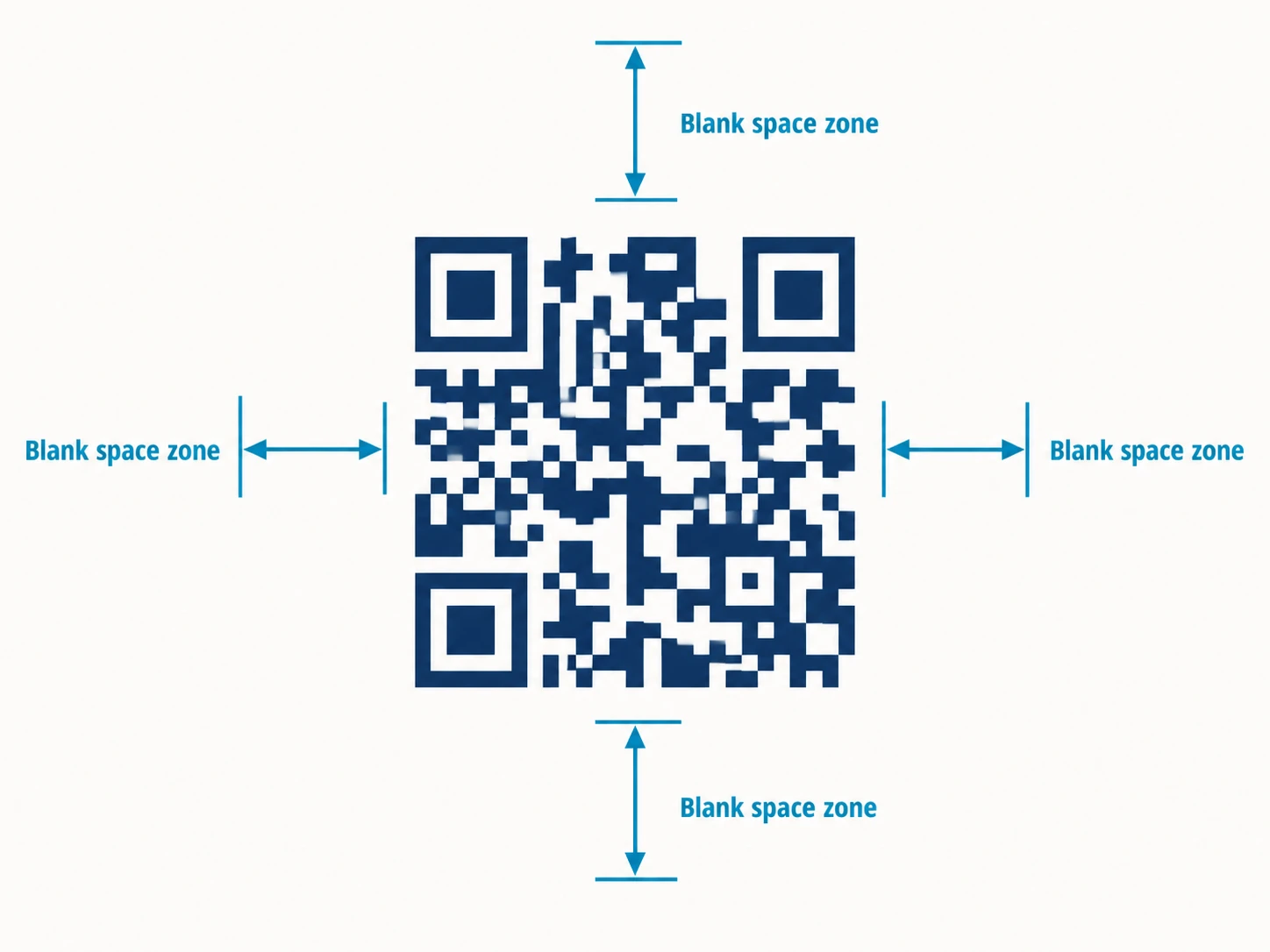
Get startedThe quiet zone is the blank margin around the QR code's border. ISO/IEC 18004 requires a minimum of 4 modules of clear space on all four sides. One module is the smallest square unit in the code grid — in a Version 1 QR code (21x21 modules), one module at the minimum print size is about 0.1 mm.
Scanners detect the code boundary by looking for the transition from the quiet zone to the finder pattern. Shorten the margin and the scanner either misidentifies the boundary or gives up and moves on. No warning — the user just sees a dead camera. In our review of print materials submitted through QR Nova, roughly 1 in 8 had quiet zones below the 4-module minimum after the printer's bleed cropped the image.
The practical check: export the code with the quiet zone included, then add additional layout margin on top. Don't trust design software to preserve the original margin.
Contrast Ratio: The Specific Numbers That Determine Scan Success
The ISO minimum is 3:1. Pass that threshold and a QR code is technically spec-compliant. Stay at exactly 3:1, though, and scan failures appear on cameras without HDR or in poor lighting. The reliable threshold is 4.5:1 — that's the WCAG AA number, and it covers nearly every smartphone camera in normal conditions.
Here are the contrast ratios for common color choices that look like they should work but often don't:
- Dark navy (#1a2a4a) on medium gray (#888888): 1.9:1 — fails on most devices
- Dark brown (#4a2700) on beige (#f5e8d0): 3.2:1 — passes the minimum, fails in poor light
- Forest green (#2d6a2d) on white (#ffffff): 5.1:1 — passes reliably
- Black (#000000) on white (#ffffff): 21:1 — the highest possible ratio, always works
The counterintuitive failure is warm colors. Red (#cc0000) and orange (#ff6600) modules on white look high-contrast visually, but camera sensors use Bayer filters that are less sensitive to red wavelengths. A 2023 Hovercode analysis found red QR codes fail on 15–20% of devices at 4:1 contrast ratios that would pass with blue or black [data as of 2023; no updated study as of May 2026 has reversed this finding]. Dark blue, dark green, or black modules sidestep this entirely.
Gradients are equally dangerous. A gradient going from 5:1 at one edge to 2:1 at the other fails at the weak edge. The scanner reads the worst part, not the average. Solid colors only.
Our honest take: if you're spending time fine-tuning a branded color palette for a QR code, spend the five minutes to measure first. We've seen more failed print runs from unchecked contrast than from any other single issue. Use the QR Nova Contrast Checker — paste your hex codes and it returns the measured ratio, the ISO verdict, and a pass/fail for outdoor use.
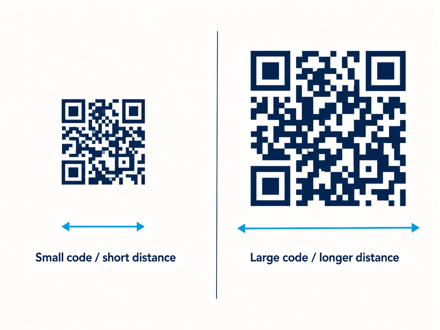
Size Rules: The 10:1 Formula and When It Breaks Down
The 10:1 rule: a QR code must be at least 1 cm wide for every 10 cm of scanning distance. Scan from 30 cm away — 3 cm minimum. Restaurant table at 25 cm — 2.5 cm minimum. Billboard at 3 meters — 30 cm minimum.
The absolute floor is 2 x 2 cm (0.8 x 0.8 inches) regardless of distance. Below that, the individual modules — the black squares that carry the encoded data — become too small for most phone cameras to resolve. Version 1 QR codes have 21x21 modules; at 2 cm, each module is roughly 0.95 mm. Most mobile sensors resolve down to about 0.5 mm, which gives you margin. At 1 cm, that margin disappears.
The rule breaks at two edges. At the small end: high-density QR codes (Version 10+, used for business cards or vCard data) have 57+ modules in the grid. The standard 2 cm minimum produces modules under 0.35 mm — below camera resolution. For dense codes, divide your expected print width by the module count and confirm each module will be at least 0.5 mm. At the large end: outdoor signage at very large sizes needs a 300 DPI source file minimum. Pixelation blurs module edges even when the code is geometrically large enough. Think of it like upscaling a low-res photo on a billboard — the image looks big but the pixels look terrible up close. Same physics.
Error Correction Levels: Choosing the Right One
ISO/IEC 18004 defines four error correction levels, each using Reed-Solomon coding to reconstruct damaged or obscured modules:
- Level L (Low): recovers up to 7% of codewords. Use only in controlled digital environments where data capacity is critical.
- Level M (Medium): recovers up to 15%. The right default for most digital and clean-print applications.
- Level Q (Quartile): recovers up to 25%. Use for outdoor signage, restaurant menus, product packaging — anything that accumulates wear or may be partly obscured.
- Level H (High): recovers up to 30%. Required any time you add a logo overlay. Also appropriate for any code that will be exposed to direct weather, heavy handling, or industrial environments.
There's a tradeoff. Higher error correction adds redundant data codewords, so the code needs more modules to store the same content. A URL that fits in a Version 3 code at Level L may require a Version 5 code at Level H. At fixed print size, Level H produces smaller modules — which can push you back below the camera resolution threshold. Test the generated code with the QR Nova Validator to confirm it scans at your intended print size.
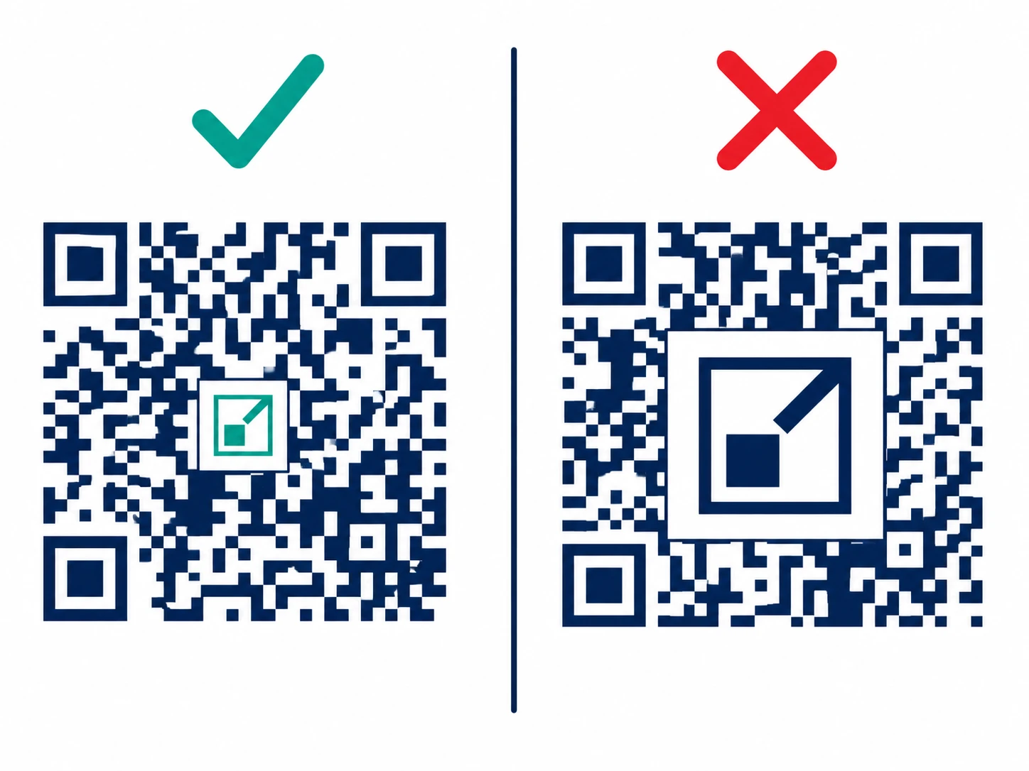
Logo Overlay Rules: The 20% Limit Is Not Negotiable
A centered logo is one of the most common branded QR code choices. It works — within strict limits most designers push past.
The hard rules:
- Logo must cover no more than 20% of the total code area
- Logo must be centered — off-center logos destroy the timing patterns the scanner uses for orientation
- Error correction must be set to Level H — this is what allows the decoder to reconstruct the modules hidden under the logo
- Never let the logo touch or overlap the three corner finder patterns (the large square-in-square targets at three corners)
- Add 4–6 pixels of white padding around the logo to prevent module-edge confusion
Here's why 20% is the real limit, not just a guideline: imagine your code encodes a short URL (25 characters) — relatively sparse grid. Logo covers 25%. Level H recovers 30%, so on paper you're fine. But error correction doesn't distribute evenly. The center modules carry a disproportionate data share for longer URLs or higher-version codes. Push past 20% in the center and the covered modules hit the recovery limit before the decoder finishes reconstructing them. Scan fails.
The safest test: generate the code, add the logo, scan on five phones including at least one older Android (2–3 years old). Any failure means reduce logo size or confirm Level H.
Color Inversion: Why Dark-on-Light Is Not Optional
Dark modules on a light background is the standard. The finder patterns and timing patterns assume dark foreground, light background. The ISO spec doesn't prohibit inversion, but most native camera apps treat it as a fallback — not a primary decode path.
About 80–85% of devices handle inverted QR codes without issue. The remaining 15–20% silently fail. If your printed material runs an inverted code — white modules on black — roughly 1 in 6 people will see nothing. They'll assume the code is broken, not that their camera app has a gap.
The only defensible use case for an inverted QR code is a digital screen with a confirmed dark UI, explicitly tested for inverted-code support across a full device matrix. Print always uses dark-on-light.
File Format and Export: The JPG Problem
JPG compression averages adjacent pixel values to reduce file size. QR code modules are hard black-and-white edges — exactly what JPEG's lossy algorithm damages. It blurs those edges, introduces color artifacts in transition zones, and at lower quality settings renders individual modules ambiguous. A JPEG at 80% quality looks fine on screen and fails on 10–30% of scanners.
The correct formats by use case:
- Print (brochures, posters, packaging): SVG — vector format, perfectly sharp at any size, no resolution ceiling
- Digital (web, email, presentations): PNG — lossless, preserves hard edges, 72 DPI is fine for screen display
- High-resolution print production: PNG at 300+ DPI minimum, or SVG converted to rasterized EPS at the press's required DPI
- Never: JPG/JPEG for any QR code, ever
Substrate and Environmental Considerations
The code's visual spec is only half the equation. The material it's printed on, and the environment it lives in, can turn a compliant design into a failure in the field.
Reflective surfaces — laminated cards, aluminum signage, mylar packaging — produce glare that crushes contrast perception. A code that measures 10:1 on a flat proof measures closer to 3:1 to a phone camera held at angle on a glossy laminate. Use matte finishes for QR codes, or test under the worst lighting the material will actually see.
Textured substrates (canvas, fabric, corrugated cardboard) break up module edges. At small sizes, those edges degrade faster than on smooth paper. Add 10–15% to your planned print size when the substrate has visible texture. Outdoor UV exposure yellows white backgrounds over months, compressing the contrast ratio even for black modules — if your code lives in direct sun for more than six months, start with more headroom than the minimum.
Photographic or patterned backgrounds are almost always a problem. The camera can't separate the module pattern from a busy background image. Even if the QR code itself is technically correct, the background acts as visual noise and raises the effective decode threshold. If you must place a code over imagery, add a solid white or light opaque box behind the entire code, quiet zone included.
One element that consistently improves scan rates in print contexts: a short CTA frame. Text like "Scan to visit menu" or "Scan for 20% off" placed above or below the code gives users context before they raise their phone. Not an ISO rule — a behavioral one. Materials with a CTA frame typically outperform bare codes in real-world conversion.
The Complete QR Code Design Rules Checklist
Run through this before sending any code to print or publishing at scale. Every item is a documented failure mode.
Quiet Zone
- At least 4 modules of blank space on all four sides
- Quiet zone is included in the exported file (not clipped by bleed settings)
- No design elements (text, borders, gradients) overlap the quiet zone
Contrast
- Foreground-to-background contrast ratio is at least 3:1 (measure it, don't estimate)
- Ratio is 4.5:1 or higher for outdoor or environmental print
- No gradients — solid colors only in the module area
- No red or orange modules — use dark blue, dark green, or black
- Dark modules on light background (not inverted)
Size
- Minimum 2 x 2 cm regardless of scanning distance
- 10:1 rule applied for the expected scan distance
- For high-density codes (Version 10+): individual module size confirmed at 0.5 mm minimum
Error Correction
- Level M or higher for all printed materials
- Level Q for outdoor signage, packaging, worn materials
- Level H if any logo is present
Logo (if applicable)
- Covers 20% or less of total code area
- Centered exactly — not visually centered, mathematically centered
- Does not touch any of the three corner finder patterns
- Has at least 4–6 px of white padding around it
- Error correction confirmed at Level H
File Format
- SVG for print production
- PNG at 300+ DPI for raster print files
- No JPG exports
Testing
- Scanned successfully on at least 3 different devices (include one older Android)
- Tested at the actual print size, not on screen at arbitrary zoom
- Tested in the actual lighting conditions of deployment (office, outdoor sun, indoor low-light)
Why These Rules Matter More for Static Codes
A dynamic QR code has a redirect layer — if the code works physically but the destination changes, you update the redirect without reprinting. A static QR code encodes the destination URL directly into the image. If the printed code is too small, too low-contrast, or has an oversized logo, that physical object is permanently broken. No server-side fix. Every copy printed becomes permanent waste.
This is why QR Nova's static codes default to Level M error correction, bake the quiet zone into the export, and include both SVG and PNG downloads. A code that's correct at creation is the only guarantee you get.
Want to verify a code before you commit to a print run? The QR Nova Validator scans the image, measures the quiet zone, checks the error correction level, and reports the encoded URL.
Quick Reference: Design Specs at a Glance
| Parameter | Minimum | Recommended | Source |
|---|---|---|---|
| Quiet zone | 4 modules | 4–5 modules | ISO/IEC 18004 |
| Contrast ratio | 3:1 | 4.5:1+ | ISO/IEC 18004, WCAG AA |
| Minimum size | 2 x 2 cm | 3 x 3 cm+ | 10:1 scan distance rule |
| Logo coverage | — | Max 20% | ISO/IEC 18004 ECC margin |
| Error correction (no logo) | Level L | Level M or Q | ISO/IEC 18004 |
| Error correction (with logo) | Level H | Level H | ISO/IEC 18004 |
| Print format | PNG 300 DPI | SVG | Print production standard |
Every item in this table is a scan failure waiting to happen if you fall below the minimum column. Start from the recommended column and work backward only when you have a specific constraint — then test before printing at scale. Generate a correctly configured code from the start at QR Nova. SVG, PNG, and the quiet zone are included in every export.
Frequently asked questions
What is the minimum size for a QR code?
The absolute minimum is 2 x 2 cm (about 0.8 x 0.8 inches) for a code scanned from 20 cm away. For billboard or signage use, apply the 10:1 rule: the code must be at least 1 cm wide for every 10 cm of scanning distance.
What contrast ratio do QR codes need?
The technical minimum is 3:1 (foreground-to-background). For reliable scans across all devices, aim for 4.5:1 or higher. Black on white gives 21:1 — the safest choice for print. Avoid red or orange modules: many camera sensors cannot distinguish warm colors from the background.
How much of a QR code can a logo cover?
A logo must cover no more than 20% of the total module area and must be centered. You must also set error correction to Level H, which allows the scanner to recover up to 30% of damaged data. Never let the logo touch or cover the three corner finder patterns.
What is the quiet zone in a QR code?
The quiet zone is the blank margin surrounding the code. ISO/IEC 18004 requires a minimum of 4 modules of clear space on all four sides. Without it, scanners cannot locate the code boundary — the scan simply fails, with no error message.
Can I use a light foreground on a dark background?
Technically yes, but many native camera apps (especially on Android) do not invert colors before decoding. A 2023 Hovercode analysis found inverted QR codes fail on 15–20% of devices (as of 2023; no superseding study as of May 2026). Use dark modules on a light background whenever possible.
What file format should I use for printing QR codes?
Always use SVG for print. JPG compression introduces artifacts that blur module edges, and PNG can work at 300 DPI but SVG is lossless at any size. Never export a QR code as JPG for physical materials.
What error correction level should I use?
Level M (15% recovery) for clean digital contexts. Level Q (25%) for outdoor or printed materials that may get dirty or worn. Level H (30%) whenever you add a logo overlay. Level L (7%) is only appropriate for controlled environments where every byte of data capacity matters.
Does a static QR code become unscannable if the design breaks?
Yes — and it's permanent. A static QR code encodes the destination URL directly in the image. If the printed design is too small, low-contrast, or damaged, the code fails forever. There's no redirect layer to update, no fix you can push. This is why design rules matter more for static codes than for dynamic ones.
Related articles
QR Code Error Correction L/M/Q/H: Which Level to Use
Level L survives 7% damage. Level H survives 30% — but adds 60% more modules. Pick the right ECC level for print, outdoor signage, and logo overlays.
QR Code for Posters: Size, Placement & Print Guide
How to add a QR code to a poster that actually gets scanned — distance-based sizing, placement, contrast, and a clear call to action. Free, no account needed.
QR Code Blurry or Pixelated? How to Fix It
QR code blurry or pixelated? Here's why it happens and exactly how to fix it, file format, resolution, printer settings, and when to regenerate.
Create your first QR code — free
Get started